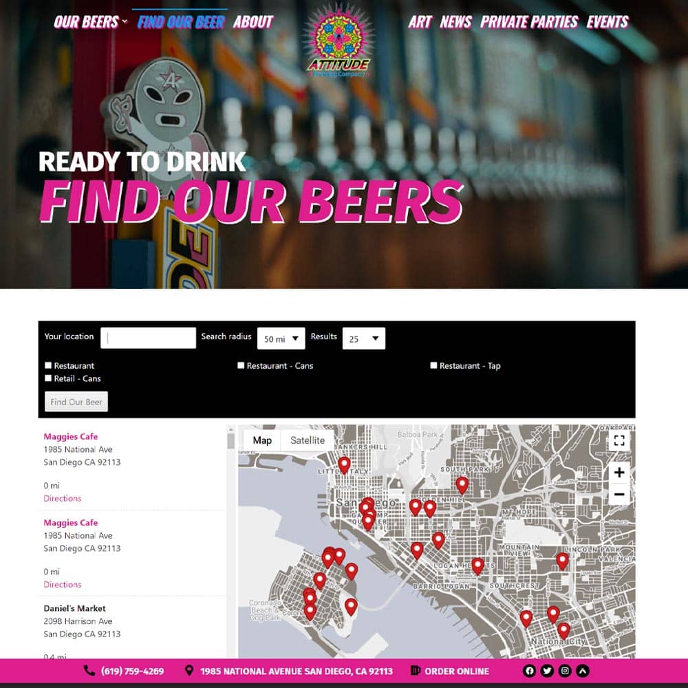
Include your business name, address, and phone number in the header.
Provide your company’s information right off the bat by putting it in the Header. This establishes trust and is also important for SEO health. Larisa Thomason from NetMechanic wrote: “You’d think this would be automatic, but many sites don’t include this vital information. Many visitors hesitate to do business with a company that won’t provide a phone number. Search directory editors look for contact information too; they may reject your site if you don’t provide it.”
Have a relevant, provoking graphic and call to action.
Every effective home page uses primary and secondary calls to action in order to direct visitors deeper into the site. There are many key phrases that work great as part of a call to action. For example, “Learn More”, “Act Now”, “Special Offer”, or “Don’t Miss Out”. CTAs get visitors to click through to what they need to do next and, more importantly, turn them into sales or leads. A good rule of thumb is to include a CTA early on the home page and an even more aggressive one towards the bottom.
Offer navigation to only key areas.
Listen, your home page is not meant to provide every last detail about your business, products, and/or services. As stated earlier, it should serve to compel visitors deeper into your site. By limiting navigation to key areas it keeps the experience simple, logical, and easy to follow. This makes for a pleasant user experience which is more likely to result in a visitor getting to those areas of your site that turn them into a customer. Key areas differ based on your type of business but can include a Services area, a Locations page, or a Coupons page.
Include a testimonial.
Testimonials work best if they are sprinkled throughout your site. That being said, start that sprinkling right on the home page. It’s a great way to welcome new visitors and qualm any reservations they may have about your products or services. It also adds an immediate human connection in an online environment where, let’s face it, it’s difficult to engage emotionally. By beginning the visitor experience by introducing them to a customer who is one of your company’s biggest fans, you’re sure to put them at ease and make them comfortable digging deeper into your website.
 Jim Sampson is the Customer Support Manager at PowerSites®, an all inclusive website-hosting, creation, and marketing solution that helps local businesses establish their brand, drive leads, and track success. PowerSites® is a leading resource in print, online and mobile for hyperlocal advertising, and brand management with our Local Business Listings.


